

Lost Decades

Summary
This summary updates regularly — the chart and probability prediction below reflect current / up-to-date values. Methodology and findings follow.
The chart above shows the likelihood of experiencing a period of long term underperformance for stocks. The methodology, and it’s limitations, are discussed herein.
At a high level, there is some relation between starting yields and forward potential for underperformance. However, the data set is too small to fully validate the model with any level of rigor. So think of this in the same way as a long term weather forecast rather than a discrete prediction. This is most useful for informing when to “pack an umbrella”, and less so in telling us exactly when (or even if) it will rain.
Introduction
A lost decade is flagged if stock returns trail bonds at any point during an 8–12 year window.
This is an important distinction and breaks away from the common convention of using negative absolute returns for stocks (whether inflation adjusted or not).
The more constructive framing is to look at expected returns for stocks against the universe of alternative assets - you have to hold something - and in this study, I look specifically at the risk free asset that is the U.S. government bond. I’ve already explored what valuations tell us about expected excess returns. Here we ask the question: What is the ‘likelihood’ that stocks underperform bonds?
Methodology
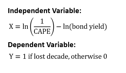
We’ll use a logistic regression to estimate the probability of a forthcoming lost decade. The independent variable will be the same as our prior study of excess returns and implied equity risk premiums.
Again, a lost decade is determined by looking at the comparative performance for the period ending in year 8 thru to the close of year 12. If stocks underperform bonds at any point in this performance window, the starting date is labeled as a lost decade.
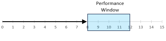
I chose a wide look-ahead period because periods that would have otherwise been underwhelming can squeak by on a technicality. The goal of this study is to answer the question: how likely are we to look up at some point in the distant future and see that we’ve experienced negative relative returns.
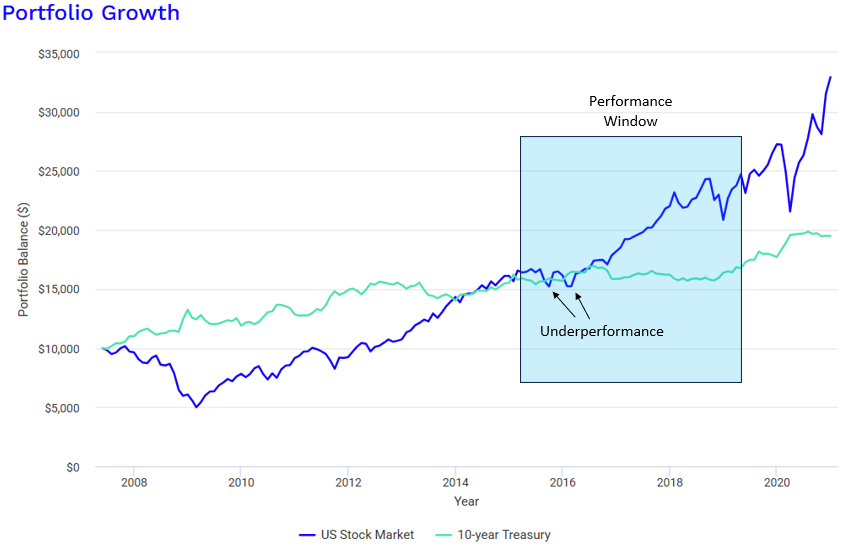
Figure 2 shows the returns of stocks and bonds starting near the peak in 2007. Again, looking at 10-year returns from June 2007 to June 2017, stocks outperformed bonds. But as an investor, we care more that we looked up in 2015 and saw that our stock returns had trailed bonds. …naturally, we care most about the impending crash in 2008, but “crash prediction” isn’t the goal of this study.
A Brief History
Before diving into a regression analysis, here’s a more qualitative look at the data.
Loss Rates
A few weeks ago, I came across a Ben Carlson article showing the stock market loss rate (in absolute terms) by holding period (restated in Figure 3).

This is a great depiction showing that stocks are expected to have positive absolute returns over very long periods. But as I’ve mentioned, this isn’t the right framing - we shouldn’t compare our returns against burying money in the back yard.
Figure 4 restates the same study, but shows the loss rates against bonds. I’ve ditched <1 year holding periods.
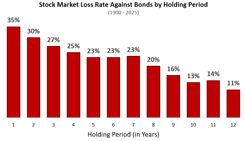
Note that my data starts in 1900 while Ben’s starts in 1950. However, restating Figure 3 for a 1950 initiation date will show very similar results.
This tells a much different story. While (as Ben Carlson shows) stocks have negative absolute returns only 7% of the time for a 5 year holding period, they underperform bonds 23% of the time over that same timeframe.
Lost Decades
Figure 5 shows all starting dates that experienced a lost decade by the definition defined in this study (red bars).
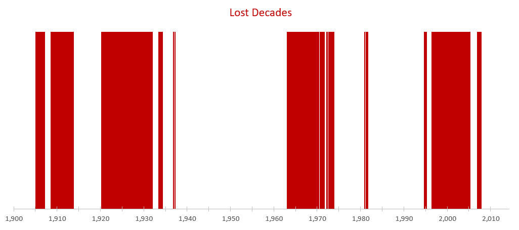
First, we see that lost decades tend to cluster together (which is expected - 1999 and 2000 will have similar outcomes). However, this clustering is amplified by our choice to look at a 4 year rolling window (using 8-12 years as our look-ahead period) - i.e., the Great Recession is captured in every data point from 1996 to 2000. By nature, this series will show very high serial correlations.
Second, lost decades aren’t very rare at all. Of the 1372 starting months in the total set, stocks saw a long-term period that underperformed bonds 34% of the time.
It’s worth noting that by this definition, even if stocks dip below bonds for a single month, it gets flagged as a lost decade. Figure 6 shows an exaggerated example of this. The January 1995 entry is flagged as a lost decade…even though performance only lagged for just a moment.
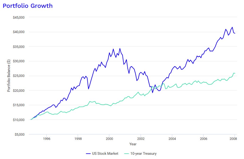
Figure 7 restates Figure 5, but adds the stock-bond spread for each starting date. A positive value indicates earnings yields > bond yields. (Earnings yield is defined as 1/CAPE)
This is what we’ll be testing against.
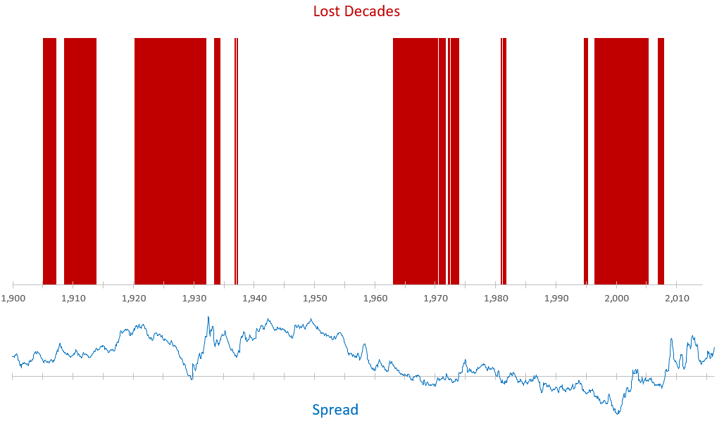
We see that even when spreads are high, stock returns aren’t immune to exogenous market events. This especially shows up in the period leading into the Great Depression. Likewise, when the spread is low or negative, it doesn’t necessarily mean a lost decade is certain (see 1990 thru 1994)…though, this period only narrowly missed the lost decade performance thresholds.
Lost Decade by Yield Spreads
Lastly, we can bin the lost decades by their starting yield spreads. Figure 8 shows the the rates of lost decades by starting spread for the full data set (1900 to 2026).
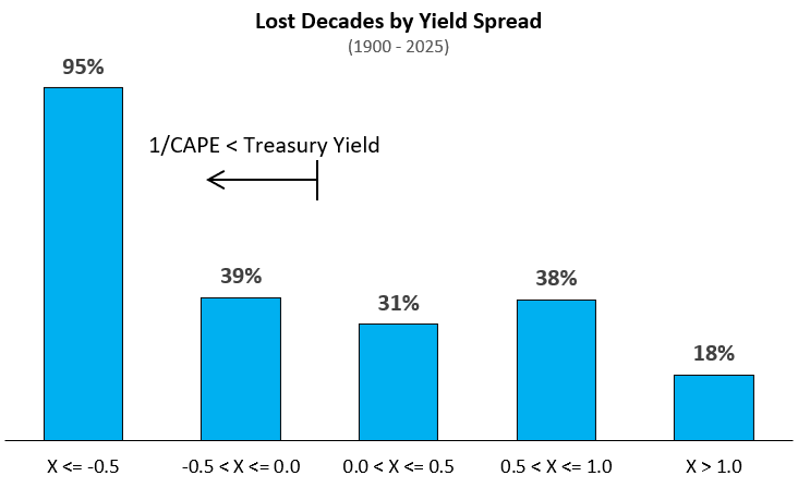
Figure 9 shows the same, but cutting off pre-Great Depression years.
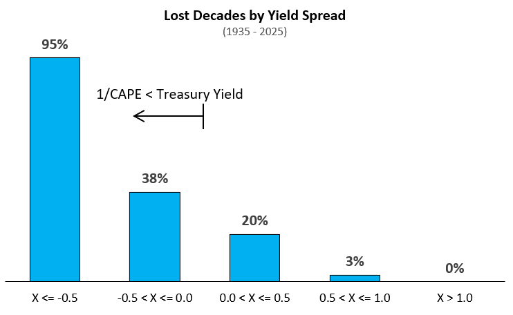
It’s notable that the first bin (X <= -0.5) contains only 1996 thru 2001 data. This was the only period in the historical data set where spreads got this extreme. However, the data does agree with the intuition that higher spreads pair with fewer poor outcomes.
Detailed Methodology & Findings
For anyone that would like to look at the data and methodology, in full, you can follow this link: Lost Decades Github
Overview
The headline is that we lack sufficient data to create a highly robust, validated model. However, I think that we do have enough information to test the relationship of yield spreads vs long term relative returns, more broadly, and with that, the long term underperformance expectations for stocks relative to bonds.
The general finding is that when stocks have starting earnings yields much higher than bond yields, there is a low probability that stocks will underperform bonds. Conversely, as that spread shrinks (or turns negative), the likelihood of equity underperformance goes up. This matches what intuition would say about this relationship. This intuition can act as further validation.
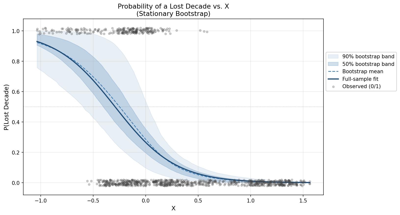
Data Set: 1935-2025
This fit was performed on the 1935-2025 dataset. It’s noteworthy that adding the 1900-1934 data keeps the relationship intact, but it’s much weaker. This is because yield spreads were quite positive in the 1920s leading into the Great Depression (shown in Figure 7). I’ll share that data further down as it’s useful to know what the impacts are, but I decided to remove it here for the main run because the Great Depression was a bit of an aberration - so much of the modern financial safeguards were birthed as a result of that crash: the FDIC, FOMC, and SEC were all created coming out of the Great Depression.
Regression
A stationary bootstrap was run alongside the full-sample fit. All parameters can be found in the Github link, above.
Figure 10 shows the final curve fit.
Validation
The gold standard in finance is the walk-forward validation. For example, it’s considered inappropriate to test a 1945 scenario using 2026 training data. In theory, we’d like to see 1945 starting conditions tested against pre-1945 training data.
There are a few problems with using walk-forward here, however. First, there’s a very long lag due to the long run nature of the study - the first test month in the study, January 1935, isn’t even resolved until 1947 (twelve years later). Second, there’s only one effective lost decade even flagged prior to 1963 (see Figure 7). For this second reason, we shouldn’t even start the validation until mid 1970s when the post-1963 data begins to resolve. This cuts our validation set in half, and that still doesn’t meaningfully add lost-decade data points to our validation training set.
Figure 11 shows the regression and validation results. The walk-forward AUC and Brier scores essentially show that while the model does a decent job of ranking risky periods, the absolute probability metrics are unreliable. So think “weather forecast” rather than a confident prediction.
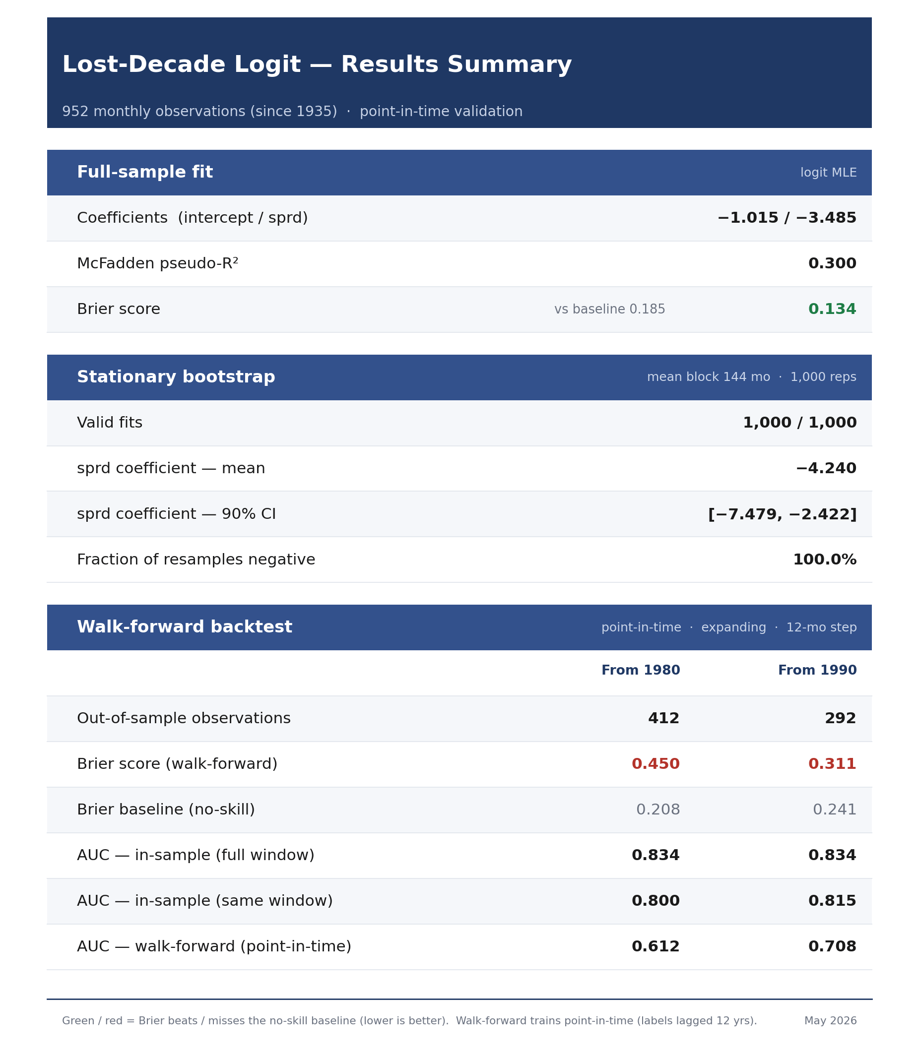
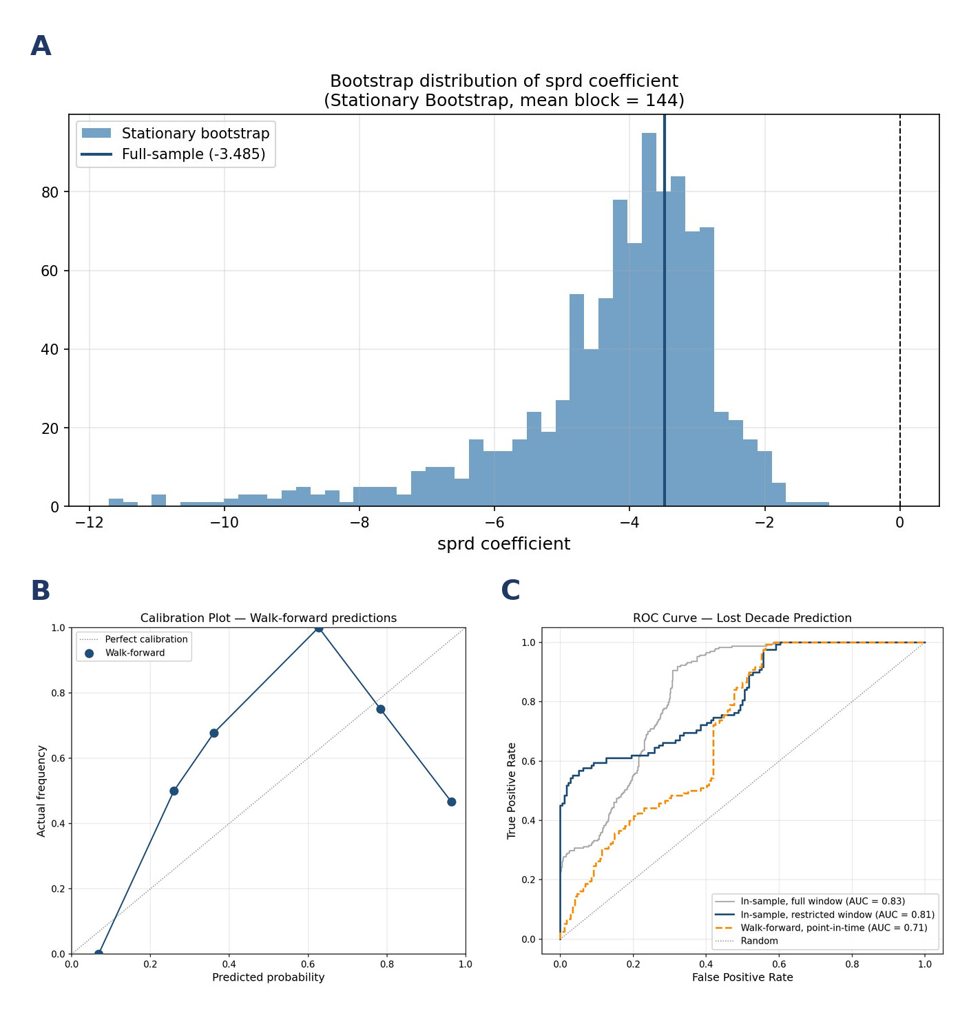
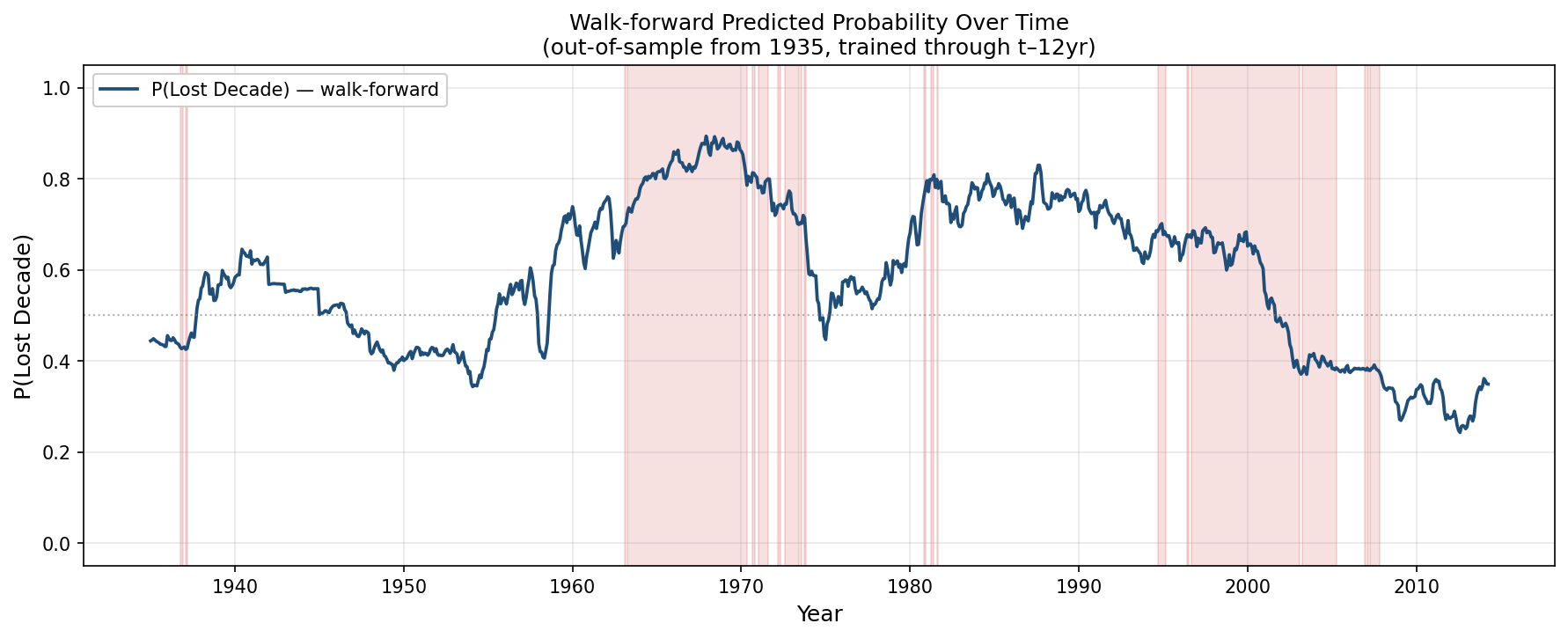
Figure 13 shows the walk-forward prediction through time (starting in 1980). We see that, while it predicted the dotcom period with good accuracy, the model also called for a high chance of a lost decade in the mid to late 1980s that never came. Though, it is notable, that the period around 1990 isn’t flagged as a lost decade only because the clock ran out (12 year performance window ended just before the dotcom burst concluded). Had the window been extended, these periods would have ultimately been flagged as lost decades as well.
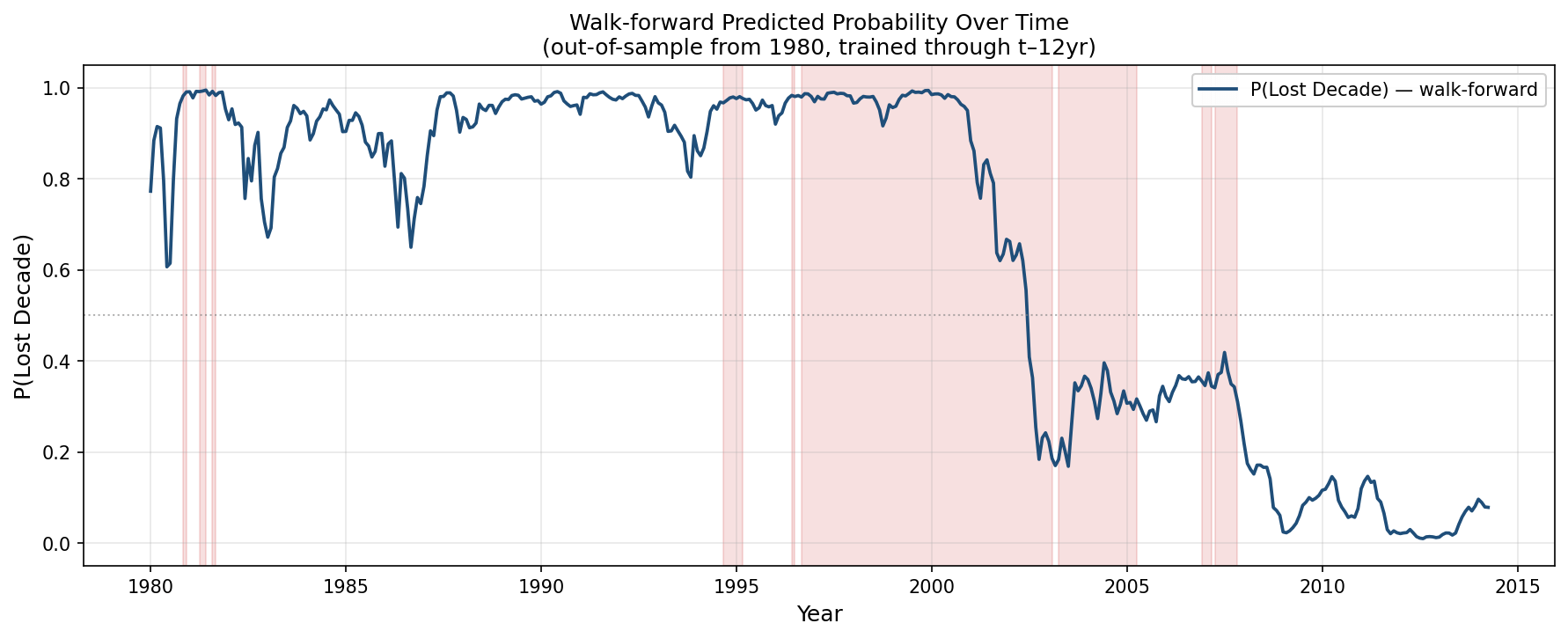
It’s also notable that the post GFC period was correctly flagged as a very low probability period.
Extending this out, Figure 14 shows the implied probabilities for the entire post-GFC era until the date of this study.
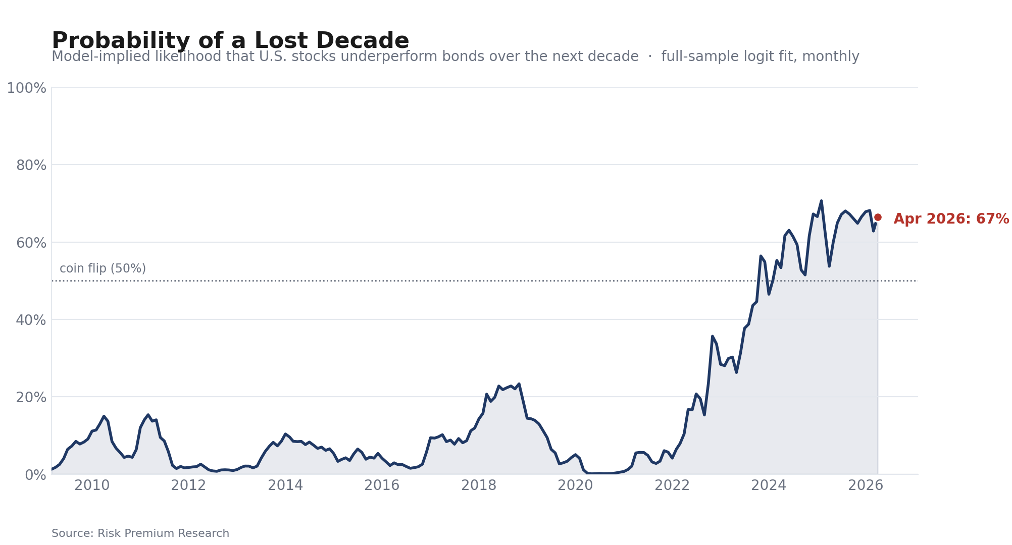
It’s interesting seeing that even 2021 was low - this was driven by the sub-1% bond yields at the time. In general, the ZIRP era was a very low risk environment in terms of lost-decade probability.
Extending to 1900-2025
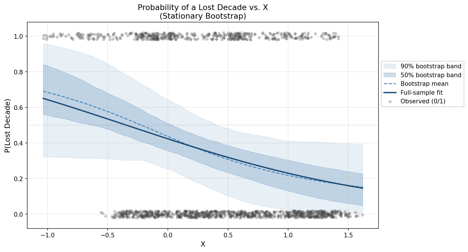
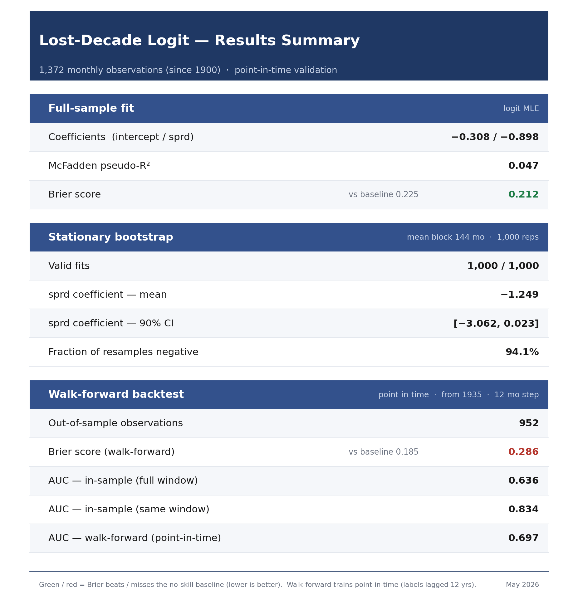
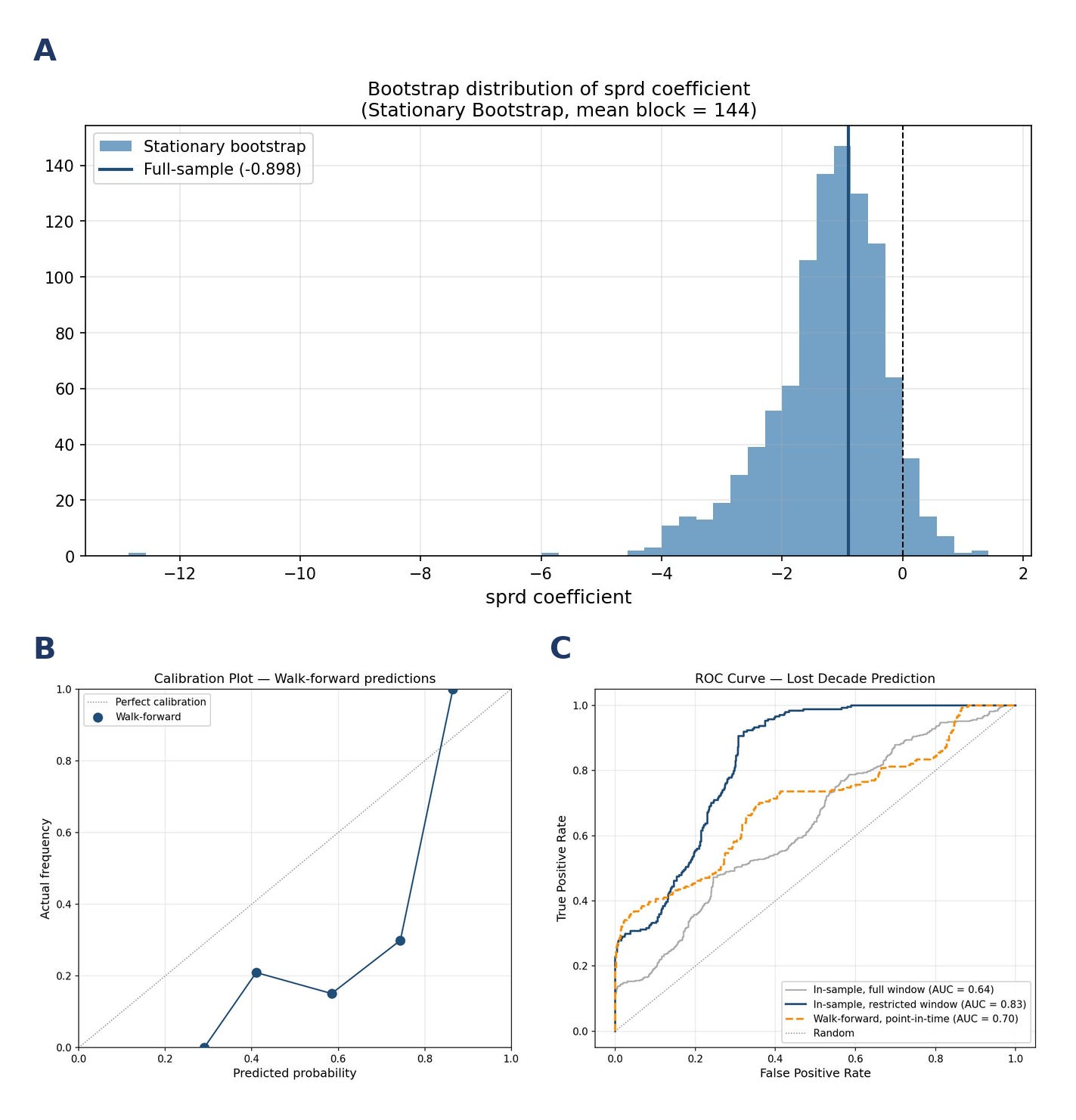
Figure 18 shows the walk-forward outputs. We see that the extremes are more muted than the earlier results.
Reference: Regression Definitions
Source: Claude
Brier Score
The average squared difference between the predicted probability and the actual outcome (0 or 1). Lower is better, zero is perfect.
The key reference point is the baseline — what you’d score by always predicting the historical average (e.g. always saying 27%). If your model’s Brier score is below the baseline, it’s adding value. If it’s above, you’d have been better off ignoring the model entirely.
What it tells you: whether your probability magnitudes are accurate. A model can rank periods correctly but still have a poor Brier score if it says 90% when the true frequency is 60%.
AUC (Area Under the ROC Curve)
The probability that the model ranks a randomly chosen lost-decade period as riskier than a randomly chosen non-lost-decade period. Ranges from 0.5 (coin flip) to 1.0 (perfect).
What it tells you: whether your rankings are correct, independent of probability magnitudes. A model with AUC 0.79 correctly identifies the riskier period 79% of the time. Comparing in-sample vs. walk-forward AUC tells you how much the model is overfitting.
McFadden’s R²
The logistic regression equivalent of R². Measures how much better the model fits compared to a model with no predictors at all. Ranges from 0 to 1, but values are much lower than linear R² — 0.1-0.2 is considered acceptable, 0.2-0.4 is good, above 0.4 is excellent.
What it tells you: overall in-sample explanatory power. It’s purely an in-sample measure, so it should always be reported alongside walk-forward AUC to show whether that fit generalizes.
Reference: Data Sources
Stock & Bond Yields: https://www.multpl.com
Monthly Stock Returns: https://www.in2013dollars.com/us/stocks/s-p-500/1900
Monthly Bond Returns: Calculated from monthly yield data